Thanks to Five Thirty Eight and NPR for the use of the figures illustrating this post. And also thanks to Nate Silver for his innovative work in political election modeling. This article explains how to interpret the Five Thirty Eight election products. Thinking about probabilistic and statistical models is tricky stuff. What Nate is doing is essentially political weather forecasting.
This post explains how to think about mathematical models of things. The models can be dynamical system models like those used in weather forecasting, statistical models also used in weather forecasting, or statistical models as used in political prediction. Models are useful for a particular range of subject matter and most models are carefully crafted to be useful in a particular region of a subject matter domain.
While working as a nuclear reactor plant designer, we used different models to predict accident response of the reactor than the ones we used to design its control laws and tune its control systems. We used radically different models to design the contents of the fuel pellets and the zoning of pellets along a pin and build up of pins into modules and modules into a reactor core.
What is a model
A model is an abstraction of some real world system that is useful in reasoning about and answering questions about the behavior of that real world system. This is true of all of the models described above and of the https://fivethirtyeight.com/ election model described after the break. When polling organizations sample the electorate, they collect information about respondents political opinions which are distilled into a statistical description of the electorate. Based on expressed preferences and responses to confirming questions, the pollster makes a model and reports preferences grouped by reported demographics. Remember, on the phone, no one knows you’re really a dog.
And remember that this post is about interpreting polls and poll based model results like those at https://projects.fivethirtyeight.com/
References
- https://projects.fivethirtyeight.com/ figures retrieved 2020-11-05.
- https://npr.org/ retrieved 2020-11-05.
Polling
Opinion researchers conduct polls of the electorate to determine candidate preference in the general adult population or the likely voter population about the subject matter of interest to the organization’s client. Most polls we hear about are produced by polling organizations having news media as their clients. The polls typically produce an aggregate approve/disapprove result and an aggregate vote for either the Democratic or Republican candidate. The polls also publish responses to the demographic and response validation questions used. Often, analysis pieces draw on these under the hood results.
Pollsters also ask numerous questions including demographic questions and issue opinion questions. From these they develop conditional probabilities describing how a holder of a particular opinion is likely to vote. These are results particularly useful to campaign cadre in designing messaging and advertising plans. Conditional probability and Bayesian inference are way beyond the scope of this article. We’re going to stay at the evening news level.
Uncertainty in Polling
Statistics is the science for sampling a population to estimate the probability density function (the mathematical equation and its parameters) that describes how a particular characteristic varies within that population.
For example we might drop a number of watermelons onto the trampoline and measure how high they bounce. We would get a number of results influenced by the height of the melon at release, the springiness of the trampoline , and the maturity of the melon. If we drop enough melons, recorded how high each bounced, and plotted the number of times the bounce fell into a specific interval, we could develop a histogram that described how high melons bounced off this particular trampoline. This is an example of continuously variable parameter analysis. We can also do the same for discrete valued parameters.
If we asked school children which ice cream flavor they preferred, chocolate, strawberry, or vanilla, we could develop a histogram of their preferences. We could do the same with any preference. If we repeated the query several times on different days, we might find that the results were different. One day, 20 might want vanilla, 20 chocolate, and zero strawberry. Another day, 10 might want strawberry, 20 vanilla, and 10 chocolate. There is quite a bit of variance in this distribution and if we bought today’s ice cream based on yesterday’s preferences, we might find ourselves with leftovers and unhappy kids who had to settle for what was left.
Reducing Uncertainty
What if we averaged the results from multiple polls of multiple sets of children? What we find is that the average preferring chocolate, the average preferring strawberry, and the average preferring vanilla converge to values that appear to describe children’s ice cream preferences in the aggregate. But buy ice cream by the averages and, children being children, those at your daughter’s birthday party would all want chocolate. That’s an unlikely outcome but a possible one.
This is what poll aggregators like Five Thirty Eight and Real Clear Politics do. They average the last month or so of poll results to make moving averages that attempt to describe the current political preferences of a population. By combining the results in this way, they reduce the variance of the averaged results by enlarging the sample set and hopefully, making it more diverse than that from any one poll. By using a sliding time window, they try to keep the average reflective of the current sentiment of the electorate.
Nate Silver corrects the individual poll results for house-effect which derives from how a given shop words its questions and selects its panels. He also ranks each poll by quality and estimates a poll uncertainty based on comparison of final results to ground truth form the one poll that matters, the election.
Five Thirty Eight Election Models
Five Thirty Eight, Nate Silver’s site, takes the math a big step further. Nate has a Chicago School Economics PhD but found professional poker somewhat more lucrative than the practice of professional economics. Poker left his scientist itch unscratched so in 2008 he developed a statistical model of the electorate that would estimate the probability Barack Obama’s election. This election was of interest to Nate as it was the first in which a presidential candidate was not a white male. Oh, and he had this idea for a data reporting website that he pitched to New York Times. He later moved to ESPN since he did sports between elections, and is now with ABC News as a result of the industry mergers.
So Nate started with the poll averages and some demographics from the census and other sources, and made a model that estimated how a population would vote based on polling and congressional district demographics. The Five Thirty Eight model is one of the few to do this. From this, the model computes percent D, R, and independent outcomes for each congressional district and each electoral vote awarding entity like those in Nebraska and Maine. He then counts up the electoral votes given to each of the two major candidates.
Nate runs the model 40,000 times randomly picking a result from the district statistical distribution to develop a histogram plot and tables of the model individual results. He sums up the district results to give state results. This modeling technique is called Monte Carlo modeling named after the famous casino.
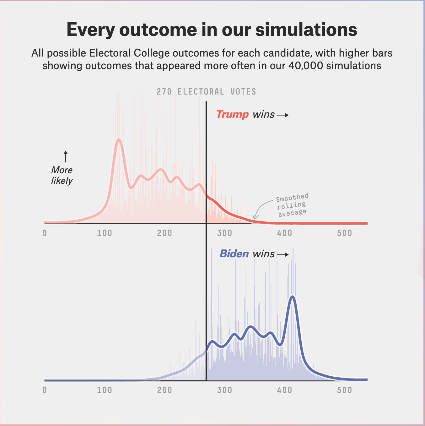
This histogram above shows the number of times each electoral vote total came up in the 2020 final run. The blue curve shows the Democratic result. The red shows the Republican result. The line is a smoothed moving average of the total EV in its window. It may also be filtered somewhat. As you can see, the histogram of this discrete random variable is pretty gnarly. None of the standard probability density functions would describe it and it would be hard to impossible to make a curve fit. So it stays a table.
The figure also shows the median number of EV awarded each candidate (median — half of trials are less, half more).
The Blue Horn
The curve comes from a sliding window calculating the total outcome counts in the window divided by the window width in bins. A spline can be fit to this smoothed result. I’m very curious why the outcomes clustered in a way to make the blue horn.
In hindsight, the election was nothing like those trials yet the blue horn has persisted from the conventions to the election. Many assumed that the election would be a landslide because of the high median outcome and that so seductive blue horn.
But the actual outcome is in there. Somewhere.
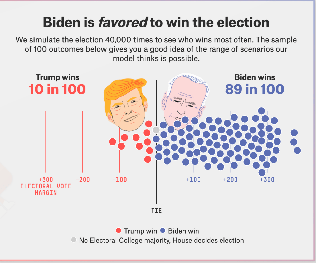
The Happy Face Diagram
The happy face diagram has one dot for each outcome that came up in the model run. This is an intermediate result along the way to estimating the winner and likelihood of winning.

The Snake
The Snake is brilliant.
The model also calculates the percentage of times that a candidate a carries a state. It sorts the state outcome probabilities from low to high and shows each as a tile in a serpentine path. The size of the tile is proportional to the number of electoral college votes to be awarded. A horizontal line divide the snake at 270 electoral votes. The model colors each tile by the probability that a party will win the state.
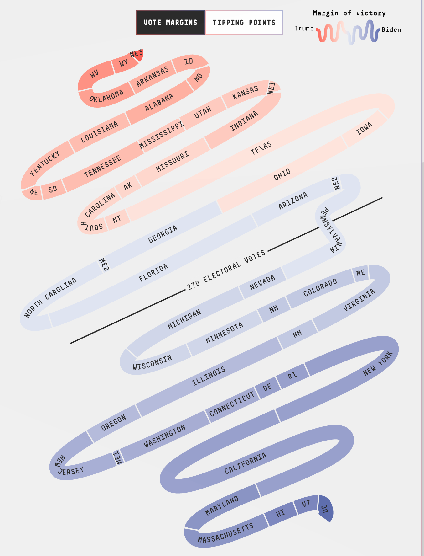
Trust the snake?
The snake is a good way about thinking about the election. As states are called we take steps along the path to victory (finish line is in the middle). The first to cross the finish line wins. If you click on a tile, you can see the model prediction for that state. But a candidate can pick up a state projected to be carried by the other. So far, there have been one surprise, Florida which kept switching sides in a near 50-50 split of outcomes. The final model results called Florida a Biden win. The preliminary ground truth results given the AP are a Trump win.

Interpreting the summaries
I think of these happy face diagrams as if they were weather advisories for the probability of measurable rain. There’s a 90 percent chance of rain and a 10 percent of dry. If it were I, I would not water my garden today but there is a 10 percent change of dry so I might have to water tomorrow.
The individual state results work the same way. Trump wins Florida 1 time of 3. That’s still pretty likely. That’s chance of thunderstorms on any given summer day here in Virginia. And Trump won Florida. The polling tracked off for some reason showing improving prospects for Biden. In early-October, Florida kept switching sides. In late October, the polling stabilized with a small Biden preference near the poll uncertainty.
Where the race stands on 11-5
Use the snake to follow along as results are reported. Tick or color each reported state or district outcome. So far, reported results are tracking each state’s placement on the snake. As this was written, NPR has been doing this on a bubble diagram with state outcomes placed in the same way as in the snake but using AP collected provisional results. Being two dimensional, it is much more compact. At this writing, here’s what the AP has called based on results submitted by each state’s election officer.
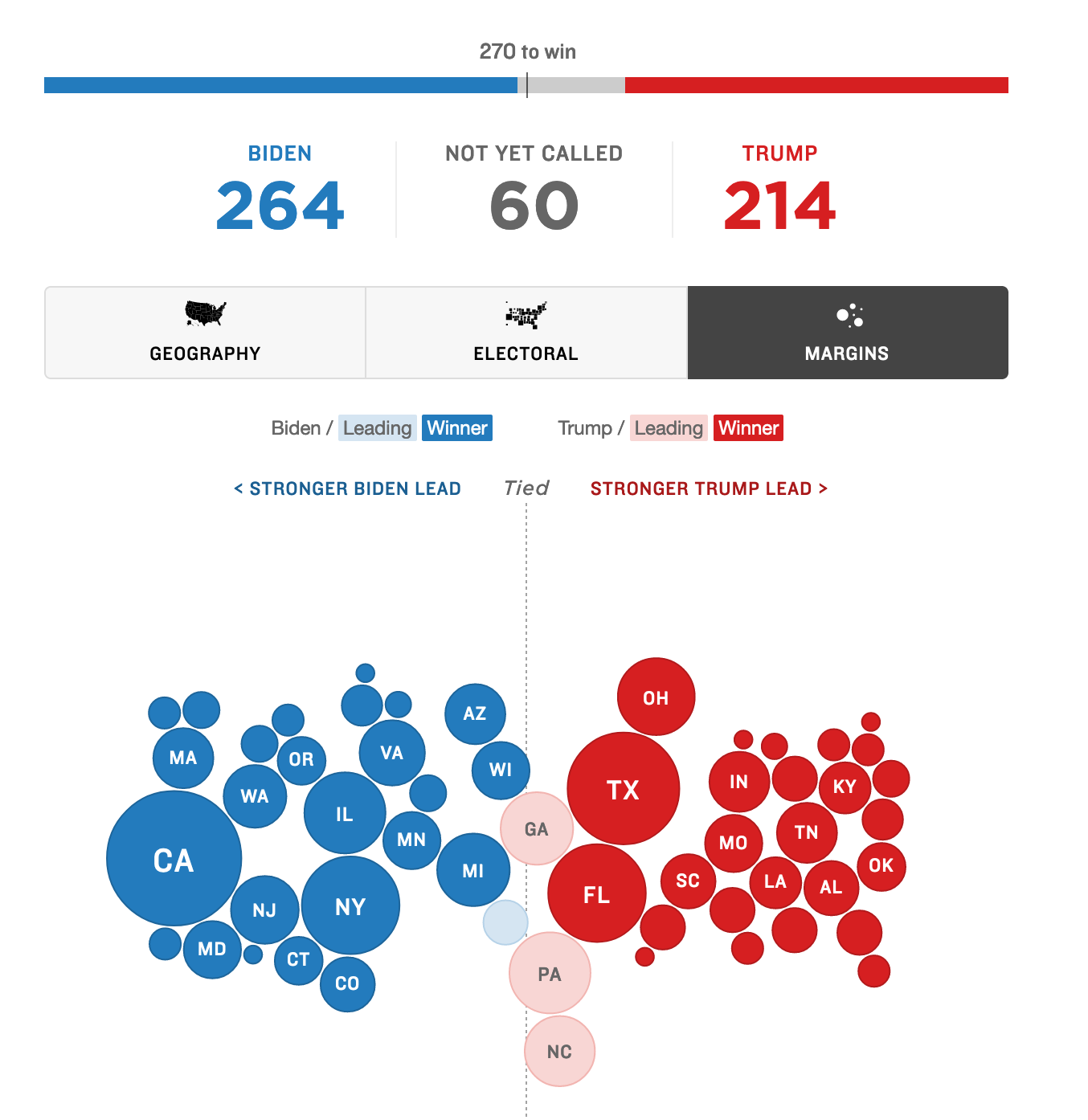
The circle diameter is proportional to the electoral votes to be awarded. The circles are shaded based on the party ahead in the uncalled states. Note that these shades can be off-whack as there are many more absentee ballots yet to be counted than the difference between candidates in the results in hand.
Its not over until…
Preliminary state results are expected Friday evening. After that, the states verify the results, and choose Electors. The Electors vote in December in the manner required by state election law. Most states bind their electors to vote as the state voted in the general election. The state then submits its certified electoral college results to Congress to be tabulated. The new congress seated in 2021 will do this. It ain’t over until Congress sings.

You must be logged in to post a comment.